When we looked at third-party studies and our customers, we found that the conversion rate of SMS marketing campaigns is–on average–29%.
That means for every four people you text, you can expect one of them to buy. That’s nearly 900% higher than email marketing conversion rates.
Let’s be clear though–29% is just the average conversion rate. Some businesses report SMS conversion rates as high as 35%.
So, what separates the top performers from those who are only “average”?
Industry plays a factor. Intangibles like brand affinity contribute too. Then there is seasonality–if you sell swimming shorts, you’ll sell more in the summer. Some elements you can control, others you can’t.
But one thing that you can influence is whether your mobile landing pages drive conversions. That’s good news because it’s a massive contributor to the performance of your SMS campaigns.
Don’t believe us? There’s the widely quoted fact that a one-second delay in page load times yields a 7% loss in conversions.
If you read the majority of mobile landing page guides, they tell you to write excellent copy, speed up your page and include an enticing call to action. It’s not bad advice, but it’s vague.
In an effort to help you improve your landing pages, we put together this article covering concrete steps you can take today. We broke them into three core areas:
- Call-to-Action
- Form
- Page Content
Call-to-action
Crafting a clear and engaging call-to-action (CTA) for your SMS landing pages is a great starting point, but it’s not enough. That’s because CTA buttons are the place you want users to click to complete the desired conversion.
So, you’ll want to incorporate these design hacks to improve SMS campaign performance.
1. A general rule
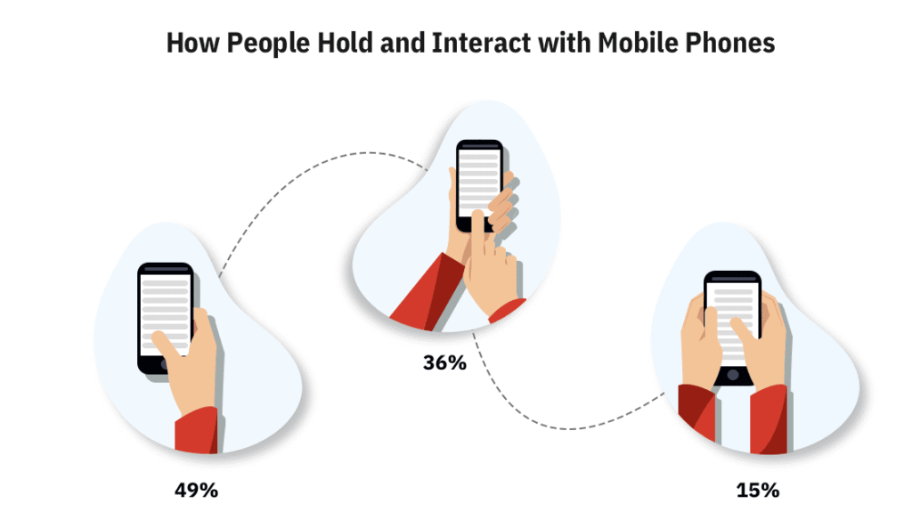
Steve Hoober conducted a study with 1,333 people and found that 49% of users hold their mobile phones one-handed.
Source: Smashing Magazine
This fact might seem irrelevant, but it has a significant impact on your SMS landing page conversion rates.
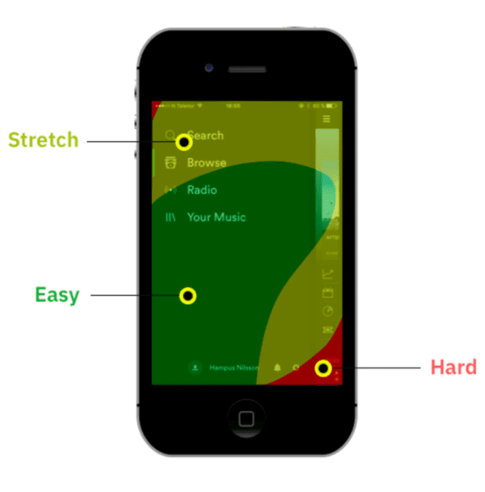
When placing your call-to-action buttons, be mindful of where your customer’s thumb is naturally placed and tailor your mobile landing page to first that.
Here’s another great graphic from the folks at Smashing Magazine that visualizes the ideal button placement.
2. Choose colors wisely
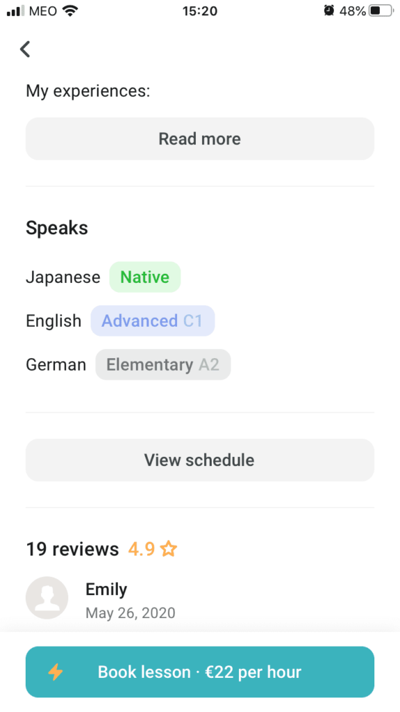
Studies have shown that bright colors with contrasting backgrounds tend to receive the highest click-through rate (CTR), which is why the two most important buttons are bright green and blue. Be sure to focus on tones similar to these eye-catching colors, without overusing them.
Here’s an example from Spotify.
Another trick is to surround your CTA button with white space to ensure that it stands out.
3. Pay attention to how you size CTA buttons
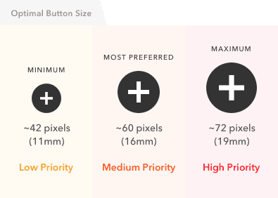
When using an array of buttons, it’s essential to indicate priority. This way, users know which CTA will lead them to the most desired result. Following the button size standard allows you to do this:
Source: uxmovement.com
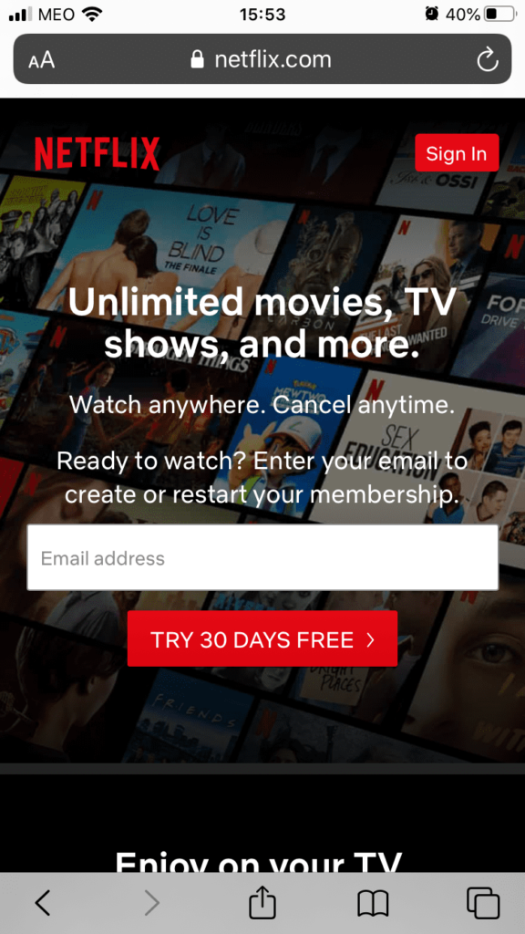
In the example below, Netflix’s primary conversion goal is to attract new users. This is why their sign-up button appears in the middle of the screen and the existing customer log-in button in the right-hand corner.
Prompting users to sign in is not as important as bringing in new users, which is why this button comes second on the page hierarchy.
Form
Don’t underestimate the power of a good form when designing your landing pages for SMS–it’s the key to generating more conversions.
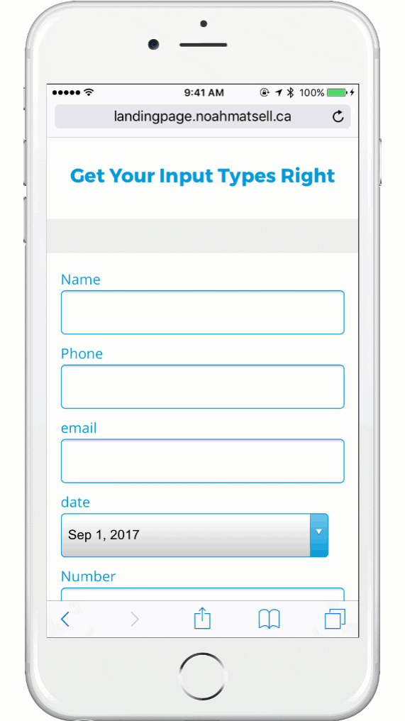
1. Adjust the keyboard for each form field
Typing is easy on a desktop computer. But it’s harder to do on a mobile device because not all the keys are visible on the keyboard at once.
If you’re requesting a zip code, quantity, or phone number, use the numerical keyboard. If you’re seeking info based on text–like a street address–use the alpha keyboard.
This small change speeds up the input process and reduces form friction on your pages. The result is an increase in SMS landing page conversions.
Source: Unbounce
2. Ask only what’s required
Using the same forms for mobile landing pages as you do for desktops is one of SMS pages’ cardinal sins.
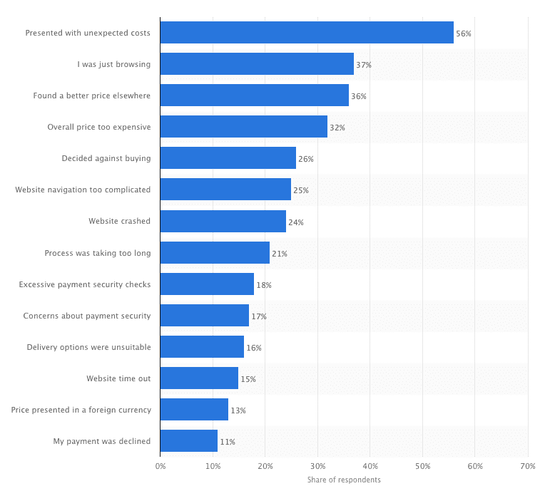
What is a breeze to fill out on a desktop becomes a nightmare on a cellphone. Plus, the longer the process takes, the more people will give up–21% to be exact.
Source: Statista
So, make sure to ask only what you need. Every additional question or field you add to a form will import your landing page’s conversion rate. Always ask yourself, “Do I need this information?”
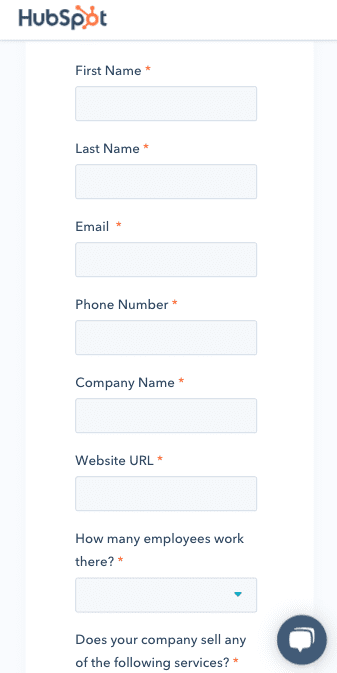
We’re big fans of Hubspot, but their mobile “Schedule a Demo” form is a little long-winded.
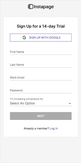
Instapage has a skeleton form on their mobile sign-up page, which gets a thumbs up from us.
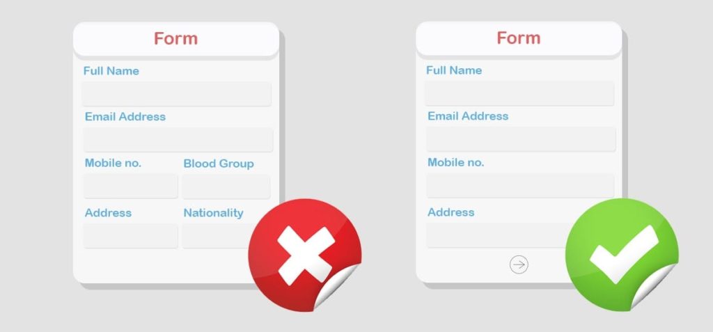
3. Avoid multi-column forms
We’re generally programmed to fill out forms in a top-down fashion.
So it should come as no surprise that studies have shown that using a multi-column form layout leads to skipped fields, data in the wrong fields, or people giving up altogether.
There are three main advantages of vertical forms:
- It’s easier to scan
- There’s a logical flow from the top to the bottom, which means the user doesn’t second-guess the next step
- It’s easier to read because the titles can go just above or beside the field
If you need to collect tons of information for whatever reason, you can always create additional form pages.
Source: wpmanageninja.com
Content
Small tweaks to CTA buttons and forms can yield significant results. But if the rest of the content on your page is lacking–or fails to follow basic guidelines–they won’t make much difference.
Here are three ways you can quickly improve the content on your SMS landing pages.
1. Keep it short and sweet
There’s an adage that says your copy should be as long as it needs to be and no longer.
There’s a lot of advice out there on how to write with brevity. Our favorite is that you need to find the most profound benefit of your product. With a landing page for SMS, you don’t have room to address every feature and benefit.
For instance, let’s say we want to sell an email productivity tool. We might use a headline like, “Get to inbox zero within 15 minutes.”
Then provide a sentence or two on how we help you achieve that aim. We definitely won’t get into the history of email and provide statistics on productivity.
Source: Unbounce
2. Focus on above-the-fold content
If you’re a religious reader of our Navigating SMS blog, you might accuse us of recycling this tip from an article on optimizing your mobile marketing campaigns.
But first impressions matter. If your “above the fold” website content doesn’t grab your visitors’ attention the second they land on your site–they won’t bother to stick around any longer. But if you get their attention, they’ll stick around and are more likely to buy.
There are a ton of tips on what to do to optimize above-the-fold content. But we’re going to pass on cookie-cutter advice. Instead, we urge you to test all the information above the fold. Changes here make or break an entire landing page, and therefore if you’re running any sort of A/B tests, you need to focus on this portion of the page.
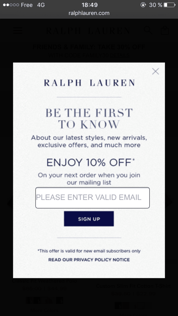
3. Pay attention to pop-ups
You’re cooking a special meal–an anniversary or birthday dinner. You source the finest ingredients. You spend hours in the kitchen chopping and grating. Then at the end, you go to season with some salt, the lid on your salt shaker comes undone, and you dump an entire shaker’s worth of salt into your culinary masterpiece.
The landing page lesson from the above scenario has nothing to do with securing lids (very important as it is). What we’re trying to illustrate is that one small mistake can ruin an otherwise excellent composition.
Many mobile landing pages are well thought out. But then there’s suddenly two different pop-ups ambushing you. One’s telling you someone in Georgia just bought a crockpot, and the other is giving you a 10% discount in exchange for your email address.
It’s what we like to call pop-up overload.
We’re not saying all pop-ups on mobile are bad. Mobile-friendly popups can convert users into leads if they’re shown to the right user at the right time.
Pop-ups should never create a bad experience for website visitors.
One compromise is to consider a pop-up centered around exit intent. For example, if someone goes to exit your site, you could offer them free shipping if their basket exceeds a certain value. Doing so can give visitors the nudge to complete their order, while not annoying anyone who’s just browsing.
Source: Wisepops
So, are your SMS landing pages optimized?
Crafting landing pages that can vault you from conversion rates to the top echelons of SMS marketers involves working on the perceived and actual friction of users.
If you’re not sure what element from above to pick, we recommend choosing one and starting split-testing it today. If you do, we predict a much higher SMS conversion rate in your future.