What is Mobile Engagement and How Do You Optimize For It?
Learn how to capture (and keep) more mobile site visitors with these effective mobile engagement tips.

Learn how to capture (and keep) more mobile site visitors with these effective mobile engagement tips.

More eyes on your site (ideally) means more clicks, more customers, and more revenue for you.
Where best to catch those eyes? Mobile. There are currently around 4.32 billion active mobile Internet users. That’s the kind of traffic you won’t want to miss out on.
So, to capture those users and keep them coming around, you’ll need a strong mobile engagement strategy.
I’ve spent hours researching the best data-backed tips out there for effective mobile customer engagement, and I’ll share them here.
TABLE OF CONTENTS
Mobile engagement is the practice of engaging customers through your mobile app, website, or mobile messaging channels. The idea is to provide customers with a reason to keep coming back to you.
When it’s done right, mobile engagement boosts your brand reputation and builds valuable, long-term relationships.
Mobile engagement is more critical than ever. The share of Americans that own smartphones rose above 85%, up from 35% back in 2011, and smartphone owners are using their devices to make decisions about which businesses they’ll buy from.
As of now, 79% of smartphone users have made a purchase online with a mobile device in the last 6 months, and 40% say they would go to a competitor after a bad mobile experience with a brand.
That means your mobile site or app needs to be smooth, helpful, and easy to navigate. Never fear, just follow these tips to make your customer’s mobile experience stand out.
Focusing on mobile engagement increases customer loyalty and grows your business. Here are some ideas to help you get started with a mobile engagement strategy.
Of course, if you’re working on engaging mobile visitors to your site, your site should be mobile-friendly. You can do a number of things to improve your site’s mobile performance, but I’ll highlight your three top priorities here.
First, avoid pop-ups unless they’re absolutely necessary.
When you do need to include them, keep your pop-ups as non-obstructive as possible (as in, only covering a small part of the screen). They should also be easy to close with a clear “dismiss” button.
Side note: Important pop-ups like an age verification form for a brewery website or cookie notices are exempt from these rules.

When it comes to how your content loads on mobile, 70% of consumers say that a page’s loading speed affects how willing they are to buy from a brand.
When looking at how you can improve your loading speed, pay close attention to your website design, especially:
Social media platforms like Instagram and Pinterest are mobile-first, and their card-based design helps with that.
Cards help users see a lot of information in as compact a space as possible, all while remaining organized. It also invites viewers to keep scrolling as new modules catch their eye between the fold.

Did you know that users with push notifications enabled for an app logged into 53% more monthly sessions compared to those who opted out?
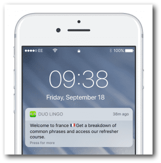
Push notifications are an easy way to grab users’ attention and drive them toward a specific action. Duolingo is a great example.
Duolingo app users get consistent reminders to return to the platform for a daily language lesson. These reminders always have a clear CTA, a time estimate to complete the lesson, and motivational language.

The length and width of a computer screen are very different from a phone screen. And while you may be able to get away with a longer article on a desktop, they aren’t as easy to read on mobile.
Cut down on the wordy content and avoid large blocks of text if you’re writing for mobile. Brevity is your friend.
Give special consideration to writing mobile-friendly headlines, which mostly means keeping headlines short and sweet (between six and ten words).
Another good rule of (scrolling) thumb is to incorporate more videos into your mobile site. Mobile video consumption doubles every year. Also, between 57% and 75% of all video plays are on mobile devices, and 92% of videos watched on mobile are shared with others.
Do you get excited every time you open your Starbucks app and see that the star tracker has moved up? I do.
That’s exactly the kind of experience you want to give your mobile visitors. Consider ways to reward your users for continuing to visit your site and make purchases, whether that’s a discount after a certain amount of money spent or a reward after a set number of logins.
The benefits from gamification aren’t just anecdotal, either. Data from M2 found a 100% to 150% increase in engagement benchmarks from website gamification.
To this point, I’ve mostly covered ways to make your existing website more engaging, but what’s the best way to convince users to engage with you? Engage with them.
That means being available to help customers with questions or concerns while they’re actively on your site — and being proactive about it.
The best way to set up your mobile customer support is generally to keep a chat icon somewhere on the screen and to let visitors know they can click it to get help (like SimpleTexting does!).

You can also list out a number where customers can call or text you, and make sure you’re actively monitoring your phones and inbox to keep response times short.
Last, but definitely not least, add a few personal touches to your mobile site experience. This isn’t just a nice-to-have feature. According to ZenDesk, 70% of consumers spend more on brands that offer personalized experiences.
What exactly does personalization mean on your mobile site? Well, it means tailoring your site experience to the individual user. You can do this by:
A mobile engagement strategy is too important (and honestly, too accessible) for any business to ignore.
My last suggestion to you is to test, test, test. Work out all the kinks before sending any big changes live. You can use Google’s free mobile-friendly tool to get a good idea of how your updates perform.
Meghan Tocci is a content strategist at SimpleTexting. When she’s not writing about SaaS, she’s trying to teach her puppy Lou how to code. So far, not so good.
More Posts from Meghan TocciLearn about the two main types of preprogrammed text messages, how to work them into your marketing strategy, and when they're the most effective.
ReadHow much can you fit in one text message? Can you send texts longer than the limit? Do emojis count? Get all your questions about character limits answered.
ReadStart a text marketing campaign or have a 1-on-1 conversation today. It's risk free. Sign up for a free 14-day trial today to see SimpleTexting in action.
No credit card required