What Are The Most Effective Calls To Action And Why?
Learn how to write a must-click CTA for any of your marketing messages by evaluating some of the best examples of CTAs across multiple industries.

Learn how to write a must-click CTA for any of your marketing messages by evaluating some of the best examples of CTAs across multiple industries.

Think of a call to action (CTA) as the business version of the bat-signal. Except, in this case, the everyday consumer is your Batman.
As marketers, we use CTAs as a way to drive our audience towards a specific response or reaction. But not all CTAs are created equal. If you’ve ever run an A/B test, you know this to be true!
So we took a look at calls to action from well-known brands and scored them on a scale of 1-5 (5 being the most effective). We look at what works—and what doesn’t—based on common marketing scenarios and, in the end, conclude what CTAs are the most effective and why.
But before we get into our rankings, we’ll begin with our official definition of a CTA to maintain the integrity of our very scientific ranking process!
A call to action is a statement written for the express purpose of driving the reader to take a specific action. It tends to come at the end of a marketing message and they generally focus on “what’s next” for the reader. They could:
Another hallmark of CTAs is a subtle sense of urgency. After all, you want people to take action while they’re looking at your message.
So, with all of this in mind, we’re developed an informal formula for what makes a successful CTA:
direction + clarity + balanced urgency = a winning CTA!
Verbs are the engine to every CTA. Here are some of the most common power verbs that successful CTAs typically include:
Now, let’s put all of this theory into action and dissect the CTAs from some successful brands.

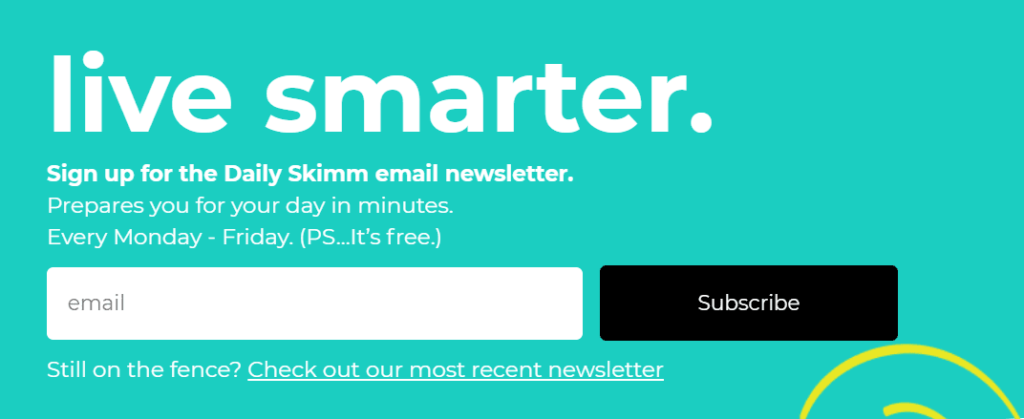
CTA: “Live smarter. Sign up for the Daily Skimm email newsletter. Prepares you for your day in minutes. Every Monday – Friday. (PS…it’s free.)”
Score: 3.9/5
❤️Why we love it: If you’re unfamiliar with The Skimm, all you need to know is that they are branding wizards who create a daily world news email geared towards millennials. This CTA is a perfect example of their cool, casual, millennial-focused messaging. This CTA does a great job of drawing you in with a universal promise (who doesn’t want to be smarter?) And follows it up with a short elevator pitch for their product that explains the who, what, where, when, and why (in 21 words).
💔What we don’t love: This CTA is great and persuasive, and all of that is slightly undercut by the message below the subscription option. Targeting people on the fence is great, but this redirect can make people more wishy-washy by offering a sample. It takes away from the energy and urgency of their original CTA, and for that we had to dock some points.

CTA: “Subscribe today and here’s what your first two boxes will look like”
Score: 5/5
❤️Why we love it: This CTA gets right to the point and has complimenting visuals to boot. This specific CTA is from one of Birchbox’s email campaigns and their use of the space and text is masterful. They provide a clear indication of what they want you to do (Subscribe) and they also give you a miniature version of the experience you’ll have if you follow through. They also stay consistent with the use of “subscribe” throughout the email making it perfectly clear what next steps are!
💔What we don’t love: There’s not a lot we don’t like about this example except perhaps the bold move to put the CTA above the fold. If you don’t have a marketing message below that cuts the mustard (like this one) this can come across as a little pushy.

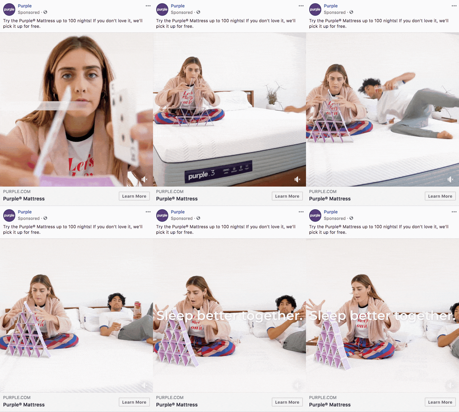
CTA: “Try the Purple Mattress up to 100 nights! If you don’t love it, we’ll pick it up for free.”
Score: 4.8/5
❤️Why we love it: Facebook ads are a great space for strong CTAs because you can reach readers from two different angles (the copy and the button). Purple took advantage of that perfectly. Their copy utilized a strong verb (try), and followed it with a promise of risk-free commitment. With a CTA that sounds almost too good to be true, they follow up with a “Learn More” button that tells interested parties exactly where they should go next to see what this is all about.
💔What we don’t love: Their use of images is great. The gif clearly shows why someone would “sleep better together” on this mattress. However, this doesn’t serve the CTA above. Total symmetry between copy and images would have made this a perfect 5 for us!

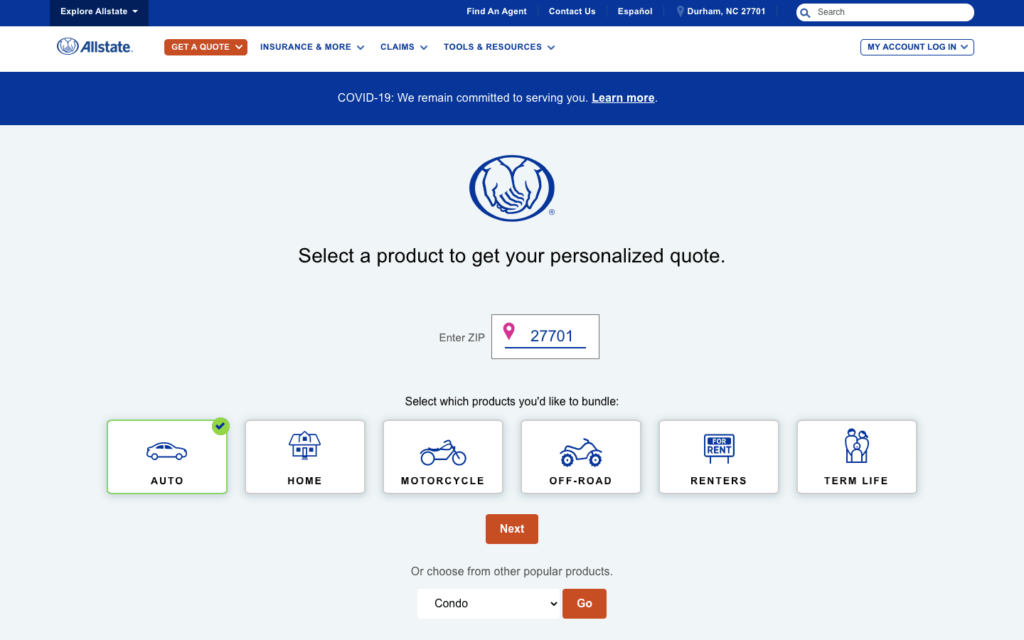
CTA: “Select a product to get your personalized quote.”
Score: 4.3/5
❤️Why we love it: Allstate goes out of their way with this CTA to make prospective customers feel a little more catered to on an individual level. Nearly every insurance company has the same basic CTA (get a quote) so they layered on some adjectives indicative of their values to give it a little kick.
💔What we don’t love: The promise of a personalized quote carries some heavy expectations that are slightly undercut when you see that the “personalized” part is really just your zip code and the kind of insurance you want.

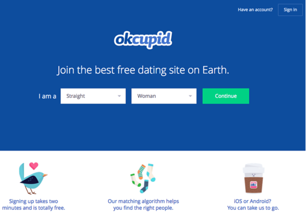
CTA: “Join the best free dating site on Earth.”
Score: 3/5
❤️Why we love it: Sometimes it pays to be bold. This CTA is confident and clear. If you’re looking for an online dating service why would you not want to join the best, free one in the world? Oftentimes brands tip toe around what they really want to say, but OKCupid puts it all out there.
💔What we don’t love: OkCupid could be the best free online dating site in the world. But nothing about this CTA tells me why that’s true. It’s great, but it’s entirely lacking evidence. It may be enough for some, but it’s certainly not enough for everyone!
Question: What do they call it when success is on the phone?
Answer: A call to action.
You have all the information you need to write a knockout CTA. Now go out there and get em’ tiger.
Meghan Tocci is a content strategist at SimpleTexting. When she’s not writing about SaaS, she’s trying to teach her puppy Lou how to code. So far, not so good.
More Posts from Meghan TocciUnsubsribes happen, but the key to a successful campaign is understanding why. Learn how to manage your opt outs and keep subscribers happy.
ReadFrom brand profiles to personal influencer pages, incorporate SMS into your social media strategy to build stronger, faster connections with your audience.
ReadStart a text marketing campaign or have a 1-on-1 conversation today. It's risk free. Sign up for a free 14-day trial today to see SimpleTexting in action.
No credit card required