Useful Tips & Examples For Church Connection Cards
Learn how to improve your contact cards with this list of best practices complete with examples. Help your connection cards meet modern day standards.

Learn how to improve your contact cards with this list of best practices complete with examples. Help your connection cards meet modern day standards.

If you were born anytime after 1993, the chances are probably high that you have to Google what a “calling” or “connection” card is. This isn’t meant to make anyone feel like a total 🦖 so much as it demonstrates how much the way we communicate has changed!
But we know what you may be thinking— if it ain’t broke, don’t fix it! So we’re not here to convince you to ditch the church connection card. But we are here to teach you how to modernize and optimize this time-honored communication tradition (you should also check out our blog on church announcements for more helpful tips for communicating with your congregation).
A church connection card (or visitor card) is a physical card that churches or ministries can distribute as a way to encourage communication from members and visitors. Connection cards can be used to gather contact details, prayer requests, and many other types of information. Churches are also beginning to connect with members via digital methods, such as an online form or text messaging service.
With concise messaging, clear calls to action, and a little bit of help from some technology, we can help you turn your church connection cards from drab to fab.

When it comes to something simple like a church connection card, it helps to understand the purpose they serve. This way, you can generate new ideas to make them more effective.
So, based on feedback from several churches across denominations, here are the top three goals of a church visitor card:
Accomplishing all three on one card may be a bit lofty. However, we’ll still provide tips for improving each of these areas. That way your church can pursue whichever area aligns closest with your needs.
Now, we’ll narrow our focus to the strategies and tactics you can use with your cards that will serve the goals from above.
1. Let go of some fields The logic here is fairly simple— the fewer fields to fill out on a form, the less work/time it takes to complete it. The less complicated your card is, the more completed cards you’ll receive. Ask yourself, do you really need phone number, email address, and physical address? Especially if you’re only using one of those as your main form of communication.
Not only does it take longer to fill out, but a form with too many fields can cause people to worry they’ll get spammed. Just remember that if you collect important info first, you can always ask for more later!
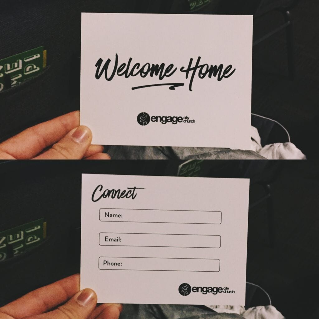
2. Keep your language simple Ensure you don’t use any slang or jargon particular to your church. People may be less likely to give you their information if they’re being instructed to “share their email to hear blessings as a follower!”
Keep it simple and appeal to their curiosity. If you include any text on your card, make sure it addresses them as a welcome visitor who may be interested in learning more about “x,y,z.”
3. Go digital How many visitor cards have you thrown in the bin because you couldn’t discern the proper name or number from the penmanship? Perhaps more than we’d like to admit. Handwriting shouldn’t prevent you from connecting prospects with their faith.
There are plenty of free tools that help you create digital “cards” around your church. Something as simple as a tablet with a Google form pulled up could be enough to both generate intrigue and receive perfectly accurate contact information in return.
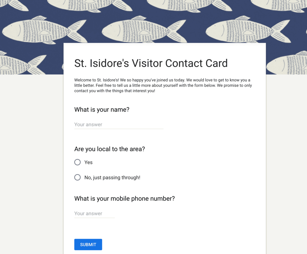
4. Create cards for different purposes There’s no rule stating you can only have one church connection card! In fact, creating multiple not only allows you to spotlight specific aspects of your church, it reduces the amount of potential clutter as well!
Give your visitors the choice to select from your array of cards created with categories of interest in mind—church volunteering, fundraising, youth ministry, altar service, bible study, etc. In doing this, you not only share information on what your church is up to, but you also pre-segment your audience based on interest. This gives you the chance to serve each parishioner with content they’re actually interested in.
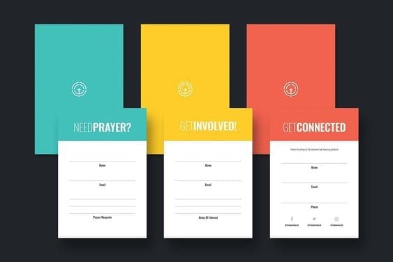
5. Use color to your advantage This tip comes in hot after the tip directly above. As you’ll see from the previous photo, simple introductions of color can help you differentiate between different bits of church-specific information. As humans, we are inherently visual. To increase the odds of your messages grabbing attention and sticking in people’s minds, use pops of color to your advantage.
6. Incorporate photos We can’t emphasize enough how important visuals are for sharing information that sticks. Using photos that depict what you’re referencing on your cards is a great way to get your point across. And since you’re actively working to reduce the amount of text on your cards, remember that a picture is worth nearly 10,000 words!
By incorporating images onto the card, you’re also making it about getting to know you as a church as well as getting to know them. That sort of reciprocity is a healthy foundation for building relationships.
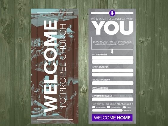
7. Opt for fun and whimsy If the previous points have touched on anything, it’s that it’s easy to ignore the ordinary. While your contact card may be simple, the visuals don’t have to be. And a boring connection card sends the message that the opportunities to get involved are boring as well. Instead, try to liven things up—it’s all in the branding. Take this card from Anchor Young Adults.
Through a little wordplay and modern design, they turned a volunteer form into an exciting opportunity!
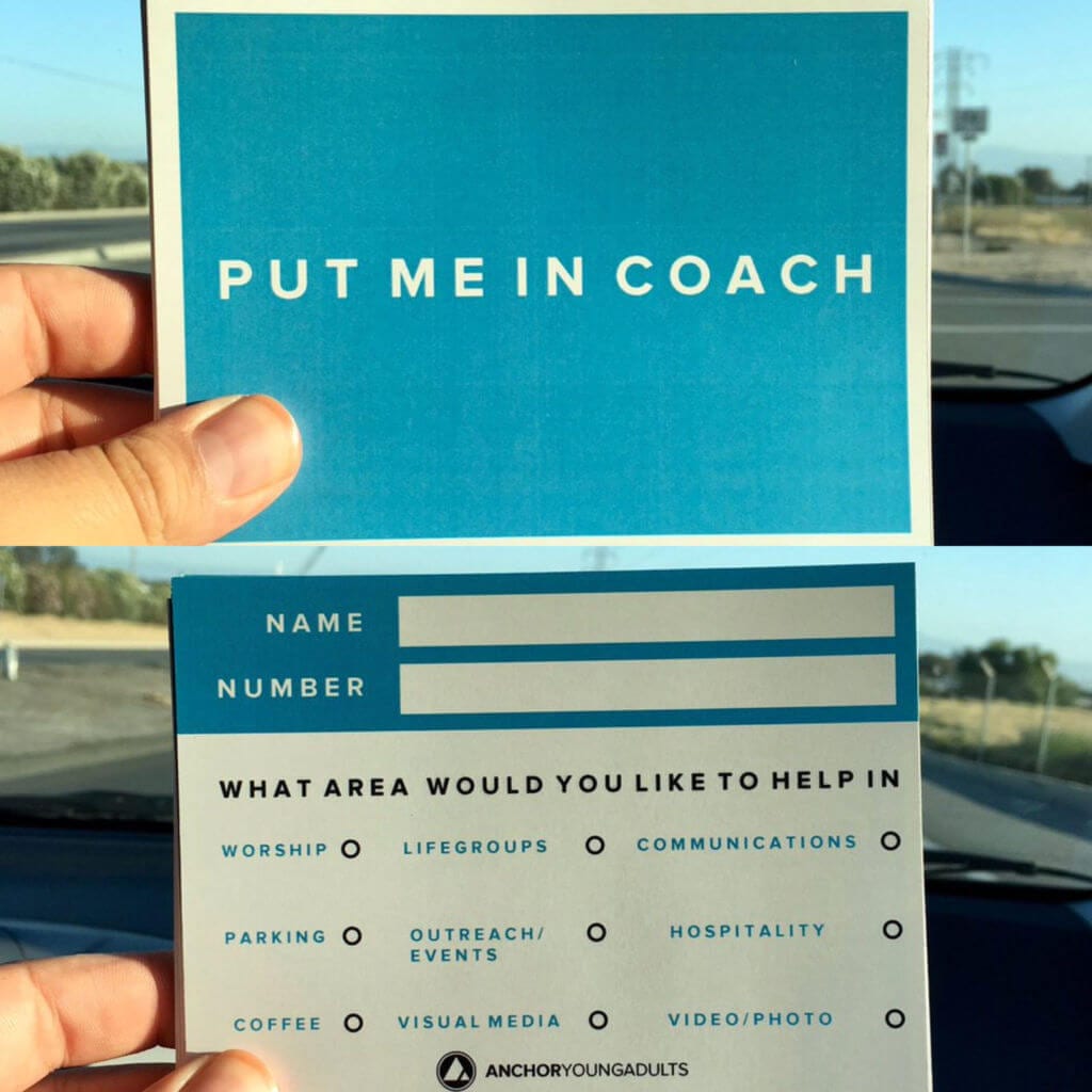
8. Provide options, not write-ins Our advice is coming full circle to the very first point we made. If you have multiple form options, it’s less likely they’ll be filled out. If you ask people to tell you what they’re interested in, they’re more likely to say “well, I don’t know.”
If you’re looking for people to get involved, it doesn’t hurt to gently nudge them in the direction of what you have to offer! Once they have an idea, the creative juices can flow freely. The card in the photo above does a great job of demonstrating how this is performed for a particular youth ministry.
9. Be timely with your follow-up Our last tip is less about the physical card and more about what you do with it. You could have the most beautiful visitor cards, but they do you no good sitting in the corner collecting dust. If you really want to capture these leads you have to follow up as soon as possible. Ideally, within the same day, the card is filled out. That way your church is still top of mind.
Thankfully, there’s one way you can follow up with a contact form submission within seconds. That tool is texting.
So, we’re breaking our introductory promise a little bit by suggesting you do away with church contact cards in favor of texting. But hear us out!
Instead of handing out cards, you could ask your congregation to text the name of your church to your phone number (don’t worry, we can text-enable a landline)!
Investing in texting hits the mark for several of our key tips above:
Getting started with a church texting service is easy! We can help you text-enable your existing landline and help you through registration/verification, or set you up with your very own number, whether you want to choose and register a local number, select and verify a toll-free number, or provision a dedicated short code.
From there, we can walk you through the process step by step. Want a preview of how texting can work for you? Test drive our platform for 14 days, totally free.
But no matter what you choose, using any of the information in this article will hopefully improve your church’s connections one way or another!
Meghan Tocci is a content strategist at SimpleTexting. When she’s not writing about SaaS, she’s trying to teach her puppy Lou how to code. So far, not so good.
More Posts from Meghan TocciAmarillo Fellowship found an easy way to encourage and inspire their congregation—just send texts! Learn how they built their list, and how they're texting church members.
ReadLearn more about mass notification systems and why text marketing software is a great solution for your church mass notification needs.
ReadStart a text marketing campaign or have a 1-on-1 conversation today. It's risk free. Sign up for a free 14-day trial today to see SimpleTexting in action.
No credit card required