How to build an effective store display for retail
Learn how to leverage your retail space effectively by styling all of your retail displays to increase sales and welcome new customers.
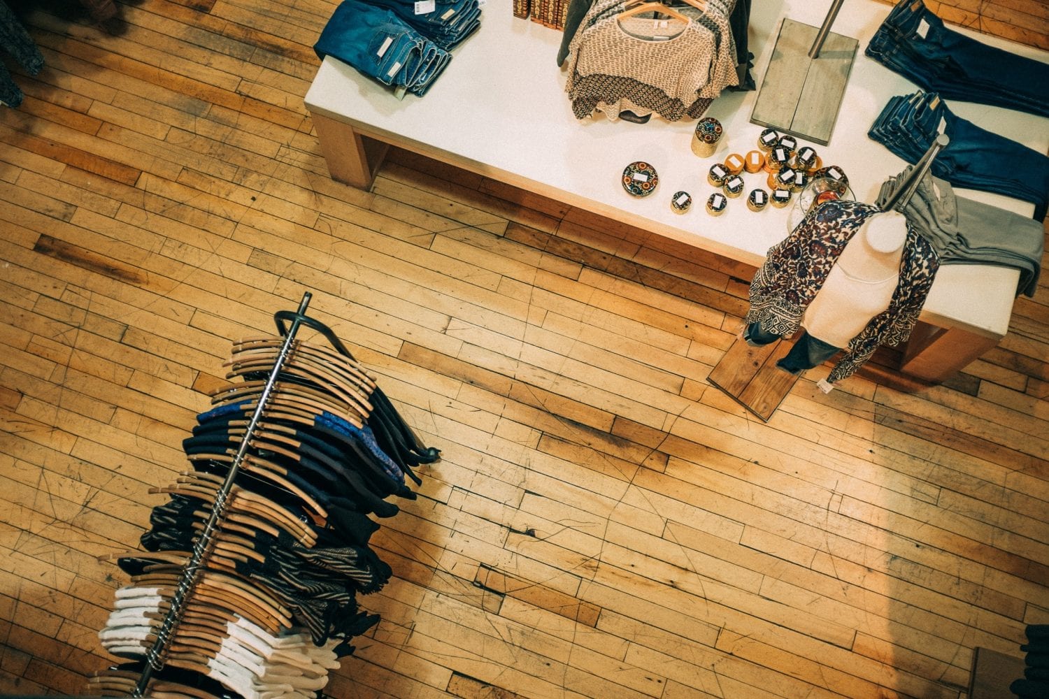
Learn how to leverage your retail space effectively by styling all of your retail displays to increase sales and welcome new customers.

Retail store displays have become such an iconic fixture in the shopping world that they’ve even inspired the creation of the term: window shopping. Most shoppers can relate to the electric allure of an interesting store display, inviting them to touch, try on, and explore the newest and most exciting products.
While you may not have had intentions of buying that item, or any item at all for that matter, an effective retail store display can stand in as your stationary salesperson converting mere lookers into customers.
So, how do you master the art of business feng shui and create retail store displays that will not only look good but also appeal to the purchasing impulse of customers?
We’ve got some tried and true tips for you, but first, we want to explain a little more about why you should even care, let alone invest your time and effort into creating retail store displays.
Retail store displays actually make up all of the in-store collections of items configured throughout a location. This includes the shelves in front of the checkout counter, the pods of mannequins placed across the floor, and any other gathering of items or signs meant to attract customer attention.
The main purposes of in-store displays include previewing new merchandise, showcasing an outfit or set of clothing in its complete form, advertising a sale, or demonstrating a product’s use.
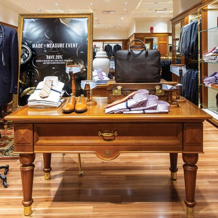
Constantly setting up and rearranging in-store displays can easily become the bane of a retail worker’s existence, so it’s valuable to share some insight into consumer behavior that demonstrates just how valuable these high-visibility display spaces can be in influencing a shopper’s behavior.
According to the research conducted by Dr. L.D. Rosenblum, Dr. Harold Stolovitch, and Dr. Erica Keeps, over 83% of the information that we process daily is done so through our visual cortexes. In other words, sight makes up most of how we perceive the world.
That may feel a bit obvious, so we’ll take the research a step further and into the context of retail. When it comes to capturing the attention of a shopper, know that a consumer’s in-store purchase decision only takes 13 seconds!
This gives you a minute and a half to take a customer through the purchasing process, and that’s if they’re even drawn to your items in the first place. But there’s an unusual display hack that gives you a leg up: color.
Within those 90 seconds, 90% of consumers will base their perception of a product based purely on color.
So, let’s talk about the anatomy of a retail display. What can you do in that 90 seconds to stack the deck in your favor? Let’s imagine we’re a customer walking through your store. We’ll break up our tips in the way order they’ll interact with your display:
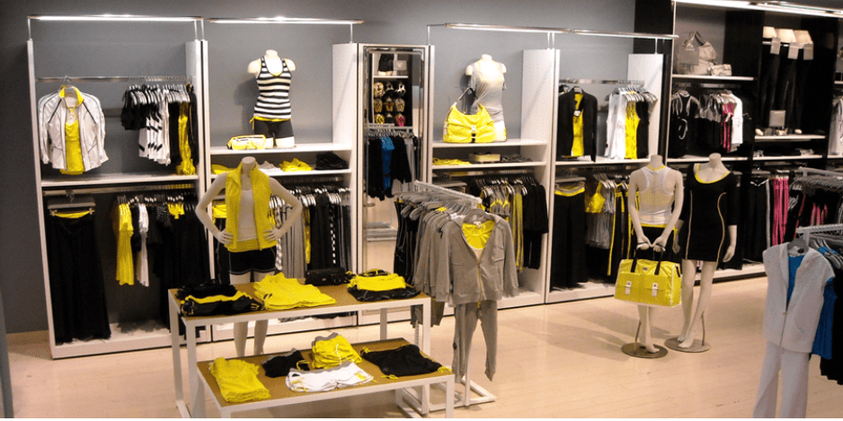
Managing the front-of-house area is akin to making your first impression with someone. It’s important that you use this space to not only grab attention but also to create intrigue. After all, you want people to come in and see more, and interact with the space.
We’ve consulted with some interior and sales experts and here are the top tips for achieving those outcomes:
And no, we don’t mean environmentally friendly (although it’s never a bad idea to protect the earth). Joey-Michelle Hutchinson, associate vice president at CallisonRTKL, shared in an interview with Retail Focus that including elements of greenery in your display can make an environment more inviting.
Fostering an environment that makes customers feel welcome is just the ticket for a window display. He went on to explain that creating an inviting scenario can reduce customer stress and even result in them spending longer in your store. And anyone who has ever spent more than 5 minutes in a Target knows, the longer you stay, the more you spend.
If there’s a space to get festive, it’s going to the front of the house. Your window displays are going to be your most frequently changed display due to the fact that it’s the most viewed. So take advantage of that by using the space to celebrate holidays and special occasions!
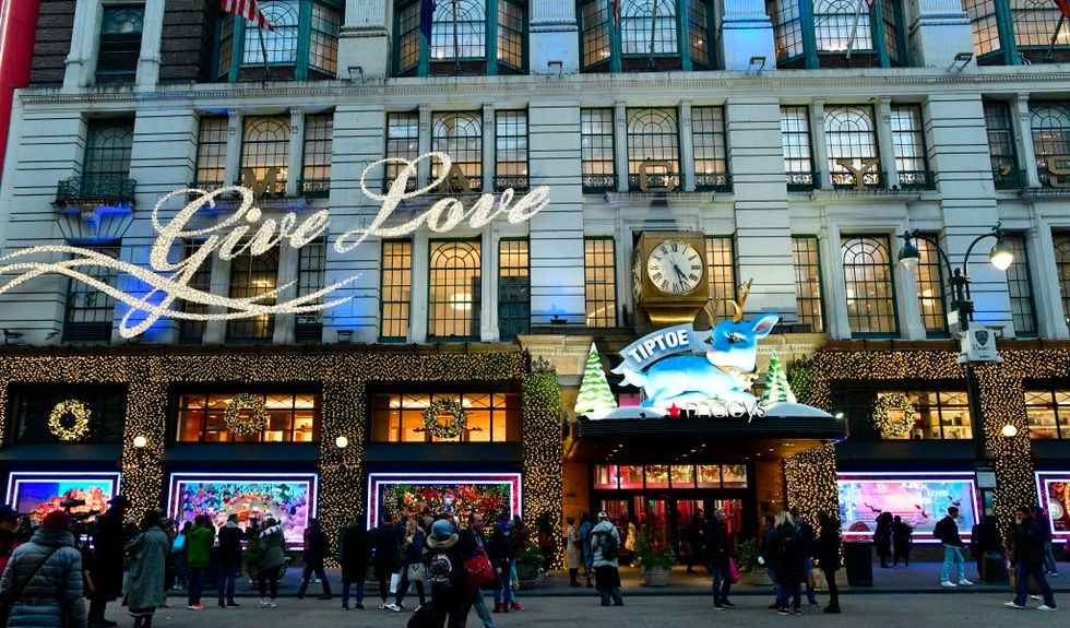
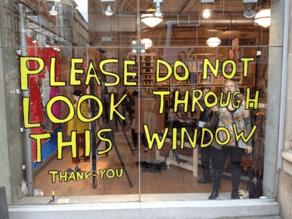
This hack is a pretty logical one when you break it down. Your goal with a window display is to get people who are passing by to stop. If a pedestrian has to read something, it increases the chances of them slowing down for a better look. However, the right ratio of text is key. After all, people aren’t stopping to read a small novel.
Including just the right amount of text (no more than a sentence) ensures people won’t take too much time to read, which tends to result in them feeling frustrated they stopped and wasted their time.
It’s also important to make sure you choose a large and legible font. While creating intrigue is nice, you don’t want the curiosity to be based on debating if your sign says “Frightful Heat” or “Fortnite Here.”
Here’s a fun example with some reverse psychology from Urban Outfitters:
If you’re looking to be a little more subtle than a sign that says “HEY YOU LOOK RIGHT HERE,” what you need is good accent lighting. You want to ensure your window display is well-lit, especially with accents pointed directly at the products you want to feature. Good lighting not only creates visual interest, but it helps your products pop!
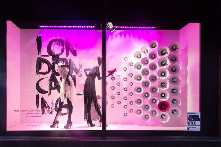
Congratulations, your customers have made it into the store and they’re ready to browse. You captured their attention with stunning window displays, now you need to keep them interested with dynamic in-store displays.
Before we get into specific tactics, here are some general tips you should always keep in mind:
Now, for a deeper dive into in-store displays, here’s what you need to know:
Unless you’re a museum or a high-end jewelry store, there’s no reason why your customers shouldn’t be able to experience your products with all of their senses.
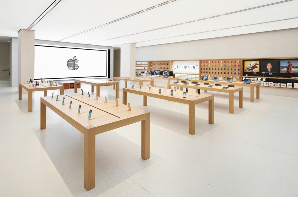
Make your displays interactive to really draw folks in. Put out a sample toy, include swatches of fabric, or have a tester ready for a demo.
If you’re skeptical about putting the merchandise out there just look at every Apple store. They draw in curious customers who want to interact with their devices making their stores virtually irresistible to techie and non-techie folks alike.
Presenting your products as a set or matching deal is both visually appealing and a great way to fill out a space in a cohesive manner. It’s also an excellent upselling tool.
Cross-merchandising also appeals to people who have brand loyalty preferences. For example, if you’re running a market or grocery store, you may want to display one brand of granola bar together so fans of the snack can check out new flavors!
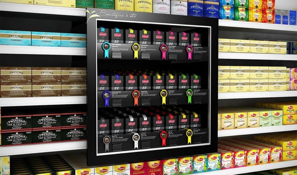
Just as text can be a great tool for window displays, instructions, or product descriptions can be an excellent supplement to in-store displays. Curious if you should include some kind of informational aspect in your display?
A good indicator is if the product you’re showcasing has a lot of frequently asked questions about it. By preemptively anticipating questions and needs you satisfy the curiosity of all your onlookers. Without it, they may leave a display interested, but unmotivated to make a purchase because they don’t have enough information.
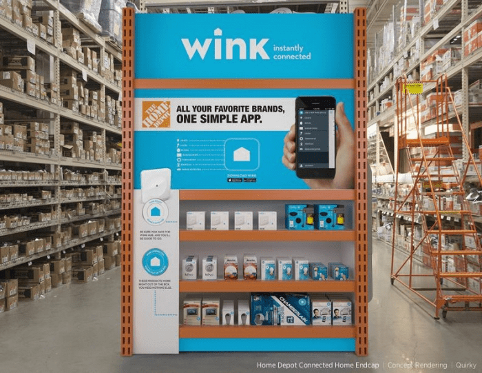
A growing trend in retail is the incorporation of technology within in-store displays. Video screens and tablets are the most popular, to name a few.
A great way to combine technology and marketing in your display would be to text-enable your retail business and create a keyword specific to your display. Shoppers interested in the product can text in that keyword to your number to immediately receive a coupon or discount on the goods/services.
Not only can that motivate a sale, but it also gives you the opportunity to continue to follow up with at that customer with more promotions of interest down the line!
For example, a sign on your display could read: Text NIKEAIR to 833-989-1120 for $25 off your purchase of the new Nike Air sneaker.
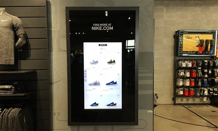
The checkout area is your final customer touchpoint. Your last opportunity to convince them that this item or another is something they can’t live without. With customers standing idly in line, this is often the best chance you have to target their boredom and inspire a last-minute impulse buy.
For this reason, it’s always best practice to stock all your smaller, low-value items at the front. The chances are higher that someone will throw a chapstick in with their haul vs. a new iPhone. Impulse shopping is largely driven by visual influence, so set yourself up for success with these tips and tricks.
You want to make it as difficult as possible for customers to avoid looking at the treats and tchotchkes you have at checkout. Studies conducted by Nielson suggest that shoppers are more likely to buy from a checkout display if they can easily see the item from the aisle. So keep your displays elevated for the most impact.
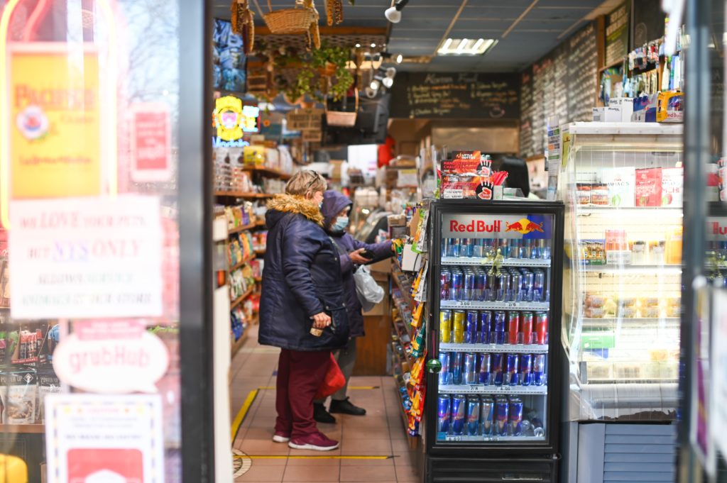
This idea came to us from a case study evaluating the success of the makeup chain Sephora’s checkout display revamp. The popular brand rolled out interactive digital displays around their shop and in their checkout line.
This now enables their guests who are waiting to check out to browse their entire catalog of 14,000 products with featured products stocked for the taking directly by the display.
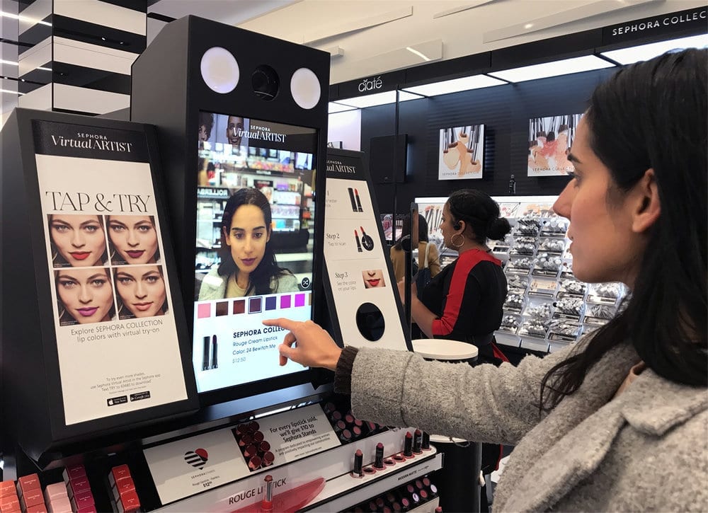
When it comes to today’s consumers, shoppers have more choices than ever before. Appeal to the smart retailer by giving your retail displays the perfect blend of function and fashion. As a result, you’ll find yourself met with a fresh and profitable brick-and-mortar experience.
Meghan Tocci is a content strategist at SimpleTexting. When she’s not writing about SaaS, she’s trying to teach her puppy Lou how to code. So far, not so good.
More Posts from Meghan TocciLearn why regional NAPA hubs utilize texting to communicate with local shop owners across the country thanks to savvy marketing group Arthur Elliott.
ReadPop-up shops are a trend that’s here to stay. Learn how to utilize the benefits of texting to help your retail location run a smooth and memorable event.
ReadStart a text marketing campaign or have a 1-on-1 conversation today. It's risk free. Sign up for a free 14-day trial today to see SimpleTexting in action.
No credit card required